Mobile-First Website Design: Why It’s No Longer Optional (and Never Should Have Been)
- Brittany Hogan
- Mar 31
- 4 min read
Let’s not sugarcoat this.
If your website is not built for mobile first, it is already underperforming.
Not “could be better.” Not “might need an update.” ↓Underperforming↓
Because the way people use the internet has changed. And Google noticed before most business owners did.
The Reality Check: Your Customers Are on Their Phones

Here’s the stat that matters:
Over 60% of all web traffic now comes from mobile devices.
Recent data puts it around 64% and climbing.
That means nearly two out of every three people visiting your website are doing it from their phone.
Not a desktop. Not a laptop. Their phone.
So let’s ask the obvious question:
If most of your visitors are on mobile…
why are so many websites still designed for desktop first?🧐
Google Has Already Made Its Decision
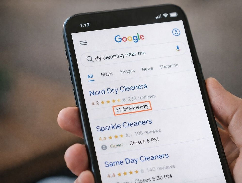
Google moved to mobile-first indexing years ago.
What that means in plain English:
Google looks at your mobile site first, not your desktop version, when deciding how to rank you.
Let that sink in.
If your mobile experience is clunky, slow, or confusing, Google assumes your entire website is.
And when Google thinks your site is bad, your rankings suffer.
Simple as that.
What hurts your score?
Slow mobile load times
Text that is too small to read
Buttons too close together
Layouts that break on smaller screens
Content that is hard to scroll or navigate
You could have the most beautiful desktop site in the world.
If your mobile version is a mess, Google does not care.
Mobile-First vs Mobile-Friendly (Yes, There’s a Difference)

This is where a lot of businesses get it wrong.
They think their site is “fine” because it technically works on a phone.
That is mobile-friendly.
But mobile-first? That is a completely different mindset.
Mobile-Friendly:
Desktop design shrunk down
Everything technically fits
User has to pinch, zoom, and struggle
vs.
Mobile-First:
Designed for small screens first
Clean layout, clear hierarchy
Easy navigation with thumbs
Fast load speed
Built for real human behavior
Mobile-first is not about shrinking.
It is about prioritizing.
Why Mobile-First Websites Convert Better

Here’s where it gets interesting.
Mobile-first design is not just about rankings. It is about results.
Think about how people use their phones.
They are:
Moving
Multitasking
Half-distracted
Looking for quick answers
You do not have five minutes to impress them.
You have maybe five seconds.
A mobile-first site does three things well:
Gets to the point fast
Makes the next step obvious
Removes friction completely
If your visitor has to think, scroll endlessly, or search for what to do next, they are gone.
A mobile-first site guides them.
The Silent Killer: Bad Mobile Experience

Here is a stat that should make every business owner pause:
Over 53% of users will leave a site if it takes more than 3 seconds to load on mobile.
And they do not come back.
Not later. Not tomorrow. Gone. Bye bye.
Now layer in poor layout, confusing navigation, and tiny text.
That is not just a bad experience.
That is lost revenue.
What a Strong Mobile-First Website Includes
This is where strategy meets execution.
A high-performing mobile-first site is not accidental. It is intentional.
Core elements include:
Fast load speeds
Large, thumb-friendly buttons
Clear call-to-action above the fold
Simple, intuitive navigation
Readable font sizes without zooming
Optimized images that do not slow the site down
Content structured for scanning, not reading paragraphs forever
And most importantly:
Clarity.
Because even the best mobile design will fail if your messaging is confusing.
A Quick Reality Test
Pull out your phone right now and open your website.
Ask yourself:
Can I immediately tell what I do?
Is it easy to navigate with one hand?
Do I know exactly what to click next?
Does it load quickly?
If you hesitated on any of those…
Your customers are too.
The Expectation Has Changed

Mobile-first is no longer a competitive advantage.
It is the baseline.
Customers expect:
Speed
Simplicity
Clarity
Ease
If your site does not meet those expectations, they do not complain.
They just leave. 👋
And they go to your competitor who made it easier.
Why This Matters More Than Ever in 2026
We are not moving toward a mobile-first world.
We are already in it.
Desktop usage continues to decline for everyday browsing. Mobile usage continues to rise. And Google continues to double down on rewarding sites that prioritize mobile experience.
This is not a trend.
It is the standard.
The Bottom Line

A mobile-first website is not about keeping up with design trends.
It is about:
Being found on Google
Keeping visitors on your site
Turning clicks into customers
If your website is not built for mobile first, you are not just behind.
You are invisible to a large portion of your audience.
Ready to Fix It the Right Way?
At Kamadu, we build mobile-first, turnkey websites that are designed from the ground up to perform.
Not just look good.
Not just function.
But actually convert.
Because a website should not just exist.
It should work for you.
If you are ready for a website that meets today’s standards and tomorrow’s expectations, reach out for a free consultation. Let’s build something that turns your visitors into buyers.


